
A step-by-step guide using your roof, brick, stone, architecture, and contrast.
Step 1: Look at Your Roof
Your roof is usually one of the largest visual elements on your home and one of the most expensive to replace.
Ask yourself:
Is it warm or cool toned?
Is it light, medium, or dark?
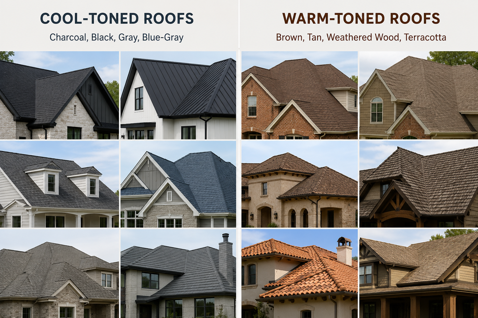
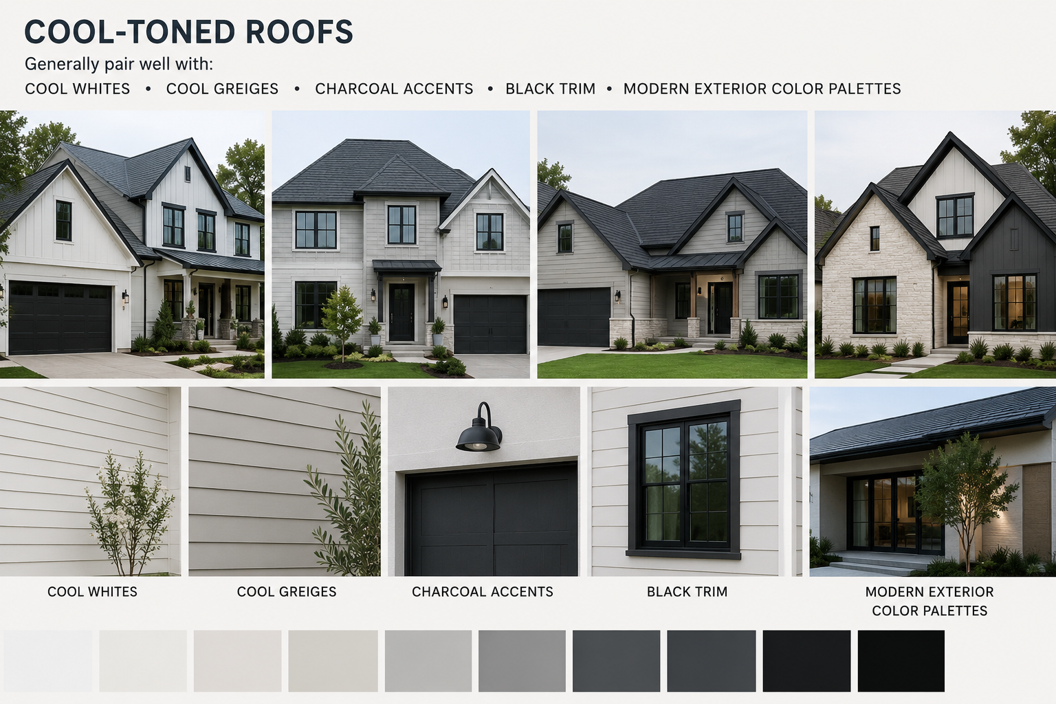
Cool-Toned Roofs
Examples:
Charcoal
Black
Gray
Generally pair well with:
Cool whites
Crisp greiges
Charcoal accents
Black trim
Modern exterior color palettes
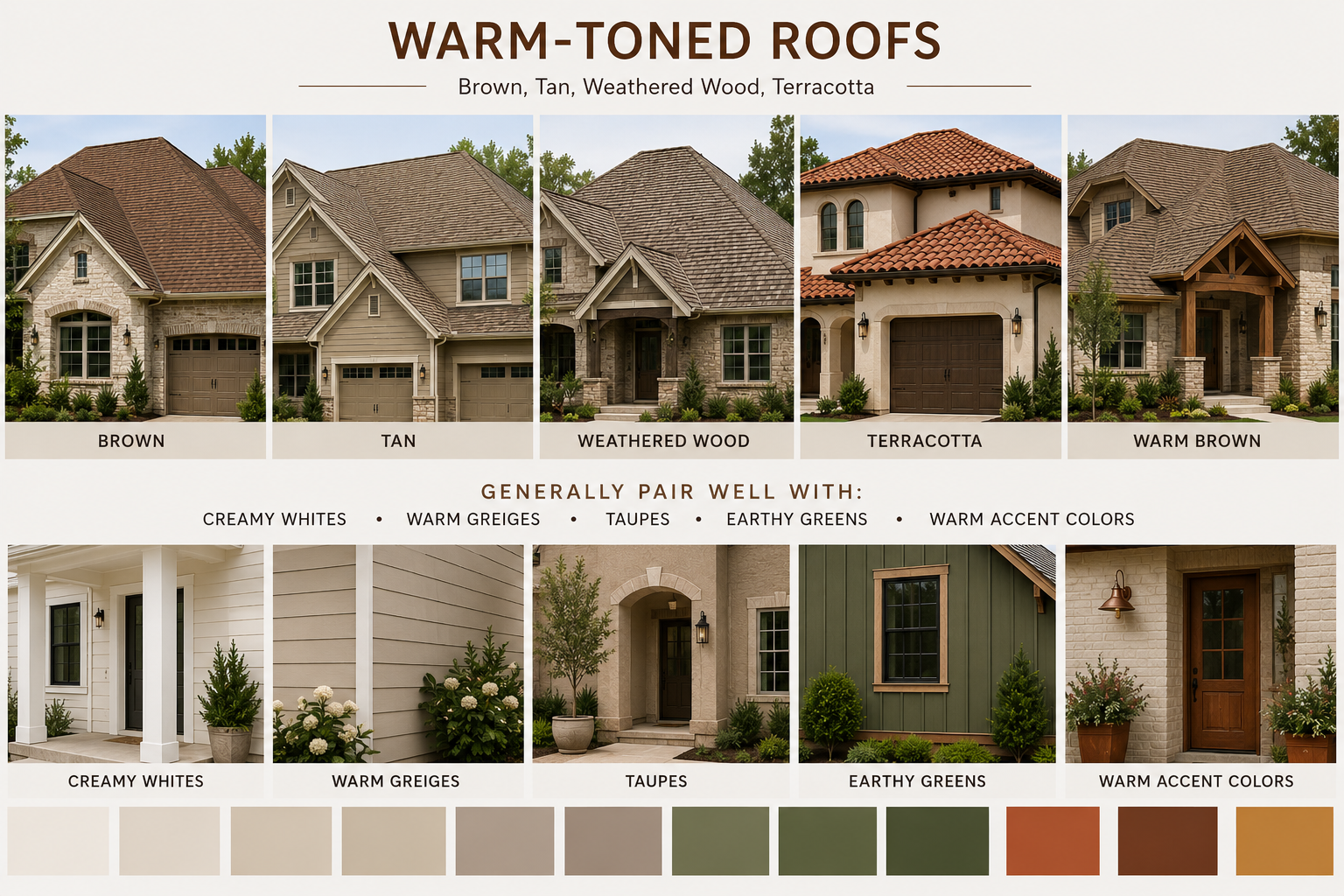
Warm-Toned Roofs
Examples:
Brown
Tan
Weathered wood
Terracotta
Generally pair well with:
Creamy whites
Warm greiges
Taupes
Earthy greens
Warm accent colors
One of the most common mistakes we see is pairing a cool gray paint color with a very warm roof. Individually they're beautiful, but together they can feel disconnected.
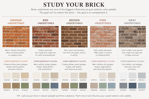
Step 2: Study Your Brick
Brick is one of the biggest influences on your exterior color palette.
Even when two bricks appear similar at first glance, their undertones may be completely different.
Look for:
Orange undertones
Red undertones
Brown undertones
Pink undertones
Gray undertones
The goal isn't to match the brick; it's to complement it. For example, a warm orange-red brick often pairs more naturally with creamy whites/warm greiges than with icy cool grays.
Step 3: Evaluate Your Stone
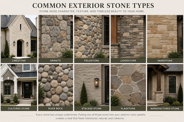
Stone is one of the most overlooked design elements. Many homeowners focus entirely on the siding and forget about the stone.
Stone may contain:
Gray
Beige
Brown
Gold
Green
Blue undertones
Pulling one of those undertones into your exterior color palette can make everything feel intentional and cohesive.
Step 4: Consider Your Home's Architecture
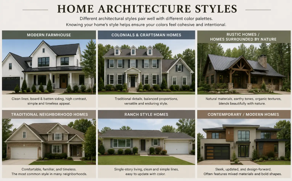
Certain exterior color palettes naturally complement certain architectural styles.
For example:
High-contrast black and white palettes often shine on modern farmhouses.
Soft traditional palettes work beautifully on Colonials and Craftsman homes.
Moody greens and deep colors often complement rustic homes and homes surrounded by nature.
The exact same exterior color palette can create a completely different feeling depending on the architecture it's paired with.
Step 5: Decide How Much Contrast You Want
Low Contrast
Examples:
Cream siding
Slightly darker cream trim
Creates:
Soft
Elegant
Timeless
Medium Contrast
Examples:
Light body
Darker trim
Bold front door
Creates:
Balanced
Classic
Versatile
High Contrast
Examples:
White body
Black trim
Creates:
Dramatic
Modern
Eye-catching
There isn't a right answer, it's simply a matter of personal style.
Step 6: Put It All Together
Now combine everything you've learned.
Ask yourself:
What does my roof tell me?
What does my brick tell me?
What does my stone tell me?
What architectural style do I have?
How much contrast do I want?
When multiple elements seem to disagree, prioritize the fixed materials that are least likely to change.
For example:
If you have a cool gray roof but warm orange-red brick, the brick will often have more influence on the final exterior color palette because it's more visually dominant.
In that situation, a warm greige may create better harmony than a cool gray.
We don't need to match every element perfectly, either - the goal is to make your home feel intentional, where every piece feels like it belongs together.
The Goal Isn't to Copy Someone Else's House
When homeowners bring us Pinterest inspiration, we're not looking for the exact paint colors.
We're looking for clues.
Maybe you're drawn to high contrast.
Maybe you love earthy colors.
Maybe you want something timeless and traditional.
Or maybe you're after a bold, modern look.
The goal isn't to recreate someone else's house.
The goal is to identify what you love about it and adapt those ideas to your own home.
The best exterior color palettes aren't copied.
They're customized.
And when an exterior color palette is designed around your home's architecture, brick, stone, roof, and your personal style, the result feels intentional, cohesive, and uniquely yours.
Need a Second Opinion?
If you're anything like most homeowners, you've probably got 47 paint samples, 83 Pinterest photos, and absolutely no idea where to start. 😅
I'd love to help simplify the process. Whether you need help choosing an exterior color palette, understanding undertones, or translating your Pinterest inspiration into something that works for your home, I'm here to help.
Reach out anytime at Scantu@360painting.com, I'd love to hear about your project.
Remember... you're not chasing the paint. You're chasing the feeling. Let's create an exterior that feels like home!